If you adore coffee as much as we do, then you very likely adore your brewing space just that much too. There’s certainly no shame in that – the brewing space is where you make amazing cups of coffee, what’s not to love?
In this article, we’re going to run through some great options to add some color and life to your brewing space, making sure that your interior decorating skills can shine as well as your brewing ability.
Coffee Art

This simple yet effective piece of coffee art is sure to bring a little visual detail to the space surrounding your coffee setup. It doesn’t have to simply be a drab space with a blank wall behind it. Instead, your brewing region can be a spot that highlights different elements of your style.
If you’re a lover of minimalism, a poster like this one that we found online would be sure to bring a little simple joy to your space. With clean lines, simplistic drawings, and perfectly contrasting text, this piece of coffee art is both informative and beautiful.
Alternatively, you could boost the light and life of a space by adding a neon sign! Neon signs have long left behind the world of 50s diners, instead being a great addition to your home. We love the simplicity of this sign – the simple yet effective cursive allows you to show off the fact that you have a simple, exciting space. Perhaps the most effective thing about this sign is the ambiance that it will create – a neon sign certainly does that.
Countertop Contact Paper
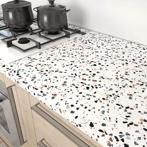
Countertop contact paper may seem like a strange choice when you consider the fact that countertops see a lot of physical disturbance in the day-to-day. Realistically, though, your coffee space will see less attention than your cooking space – it’s unlikely you’ll be mincing an onion for your next espresso, though you might need to mop up a spill.
With that low-impact type of environment, using contact paper to boost the counter that you’re working with can be sure to create a pretty, exciting space that you’re happy to work in.
We really like this option from LaCheery, which features a white background flecked with different colored blobs. These shapes are intrinsically pretty, creating a space that’s at once arresting and calming.
Contact paper such as this option would work well as a form of feature architecture, where the space that you’re creating is designed to have one feature that stands out prominently. By making that space the countertop upon which your coffee equipment sits, you’re drawing attention and focus to the world of coffee in your home. For something a little simpler, you could opt for something like this marble-effect pattern that is very subtle and understated. This would allow you to have your coffee space be fairly simple and calm, while also being neat, tidy, and polished. Marble-style spaces had a big moment a few years ago, which led to them being a bit less popular in the public eye. In truth, however, we think it might be time for them to have a mini-comeback. Though it’s quite basic, it’s a simple, effective style!
Decals
Knowing what makes a decal or a sticker is something quite complex, and something that we’re not entirely able to confirm. Really, though, we would consider the difference to be that decals go on a wall, while stickers are smaller affairs – the kind of thing that might be considered stationary.
The reason that they’re so popular is that they can allow you to easily recreate designs with relatively little effort. To that end, we might suggest considering something a little more complex than words – some form of art would work very well.
For a fairly minimal addition to a busy room such as the kitchen, we would suggest a decal like this one, from JS Artworks. It’s a simple, humorous concept designed to convey a coffee cup having been tipped over as it stood atop a light switch. This is a very basic addition, but it’s a fairly cute design that can add a little character to a space.
Something we quite like about the idea of using decals is that they can be shifted and changed if you need them. For example, you could remove some element of the spilled coffee in this image – that would allow you to fit the decal to size without worrying about painting over a dark color in your home.
Stencils
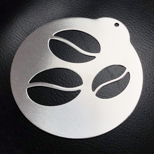
The type of coffee stencil that you’re most likely to consider when thinking about those words is the type that’s used to tip cocoa powder into certain patterns on top of coffee. While that is the job for which those devices are designed, they can be used for a range of things – a stencil will function in the same way no matter what you’re ‘painting’ with.
By this, we mean that you could very easily use some stencils with coffee-style designs on them to draw designs on your walls. If you have a feature color in your kitchen, for example, the color could be used to stencil coffee beans or mugs of coffee onto the wall, creating an evocative design.
We really like this option from the Jennimer store, since it contains a number of designs that are especially coffee related. By this, we mean that there is a coffee bean design, for example, as well as a design featuring a steaming mug. Used as paint stencils, these could create simple, effective designs for your space.
Remember, though, if you do use them for paint, make sure to clean them thoroughly before using them for your drinks!
Conclusion
We hope that this article has been able to boost any ideas in your mind about how you might like to change and boost your coffee space. It doesn’t have to be an exceptionally simple location in your home designed just for function, it can also be beautified to ensure that the space brings you a little joy.
